


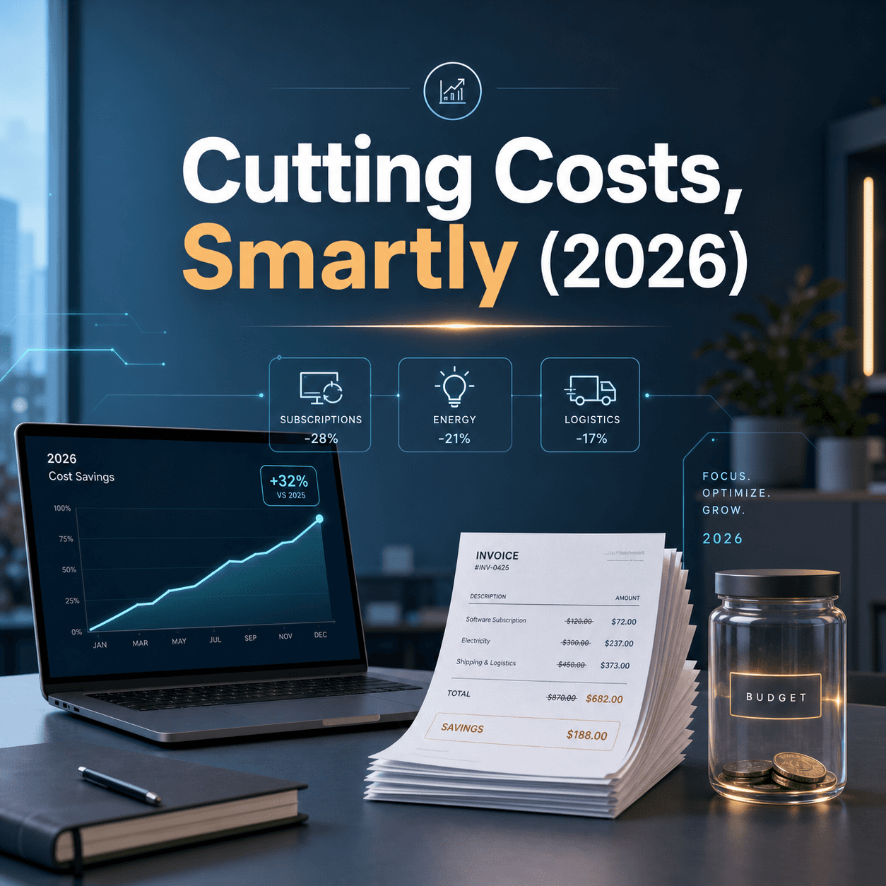


I used to think “performance analysis” was basically a fancy way of saying, look at the dashboard once a week and hope nothing is on fire.
Then you join a team that actually cares about numbers. Or customer experience. Or shipping on time. And suddenly you are swimming in metrics, reports, standups, postmortems, sales calls, tickets, NPS, churn, cycle time, revenue retention, a dozen Slack channels.
And the weird part is this. Most teams are not starving for data. They are drowning in it.
What is changing right now is not that we can measure more. It is that we can finally connect the messy reality of work with the numbers we stare at. And we can do it faster, with fewer people manually stitching stuff together.
So here are the technologies that are quietly rewriting how teams analyze performance, across product, engineering, marketing, sales, support, operations. Basically everyone.
The shift from static dashboards to living systems
Dashboards are not going away. But a lot of teams are realizing a painful truth.
A dashboard is a snapshot. And most performance questions are not snapshot questions.
People ask things like:
Why did conversion drop in Germany last Tuesday? Which cohort is actually sticking around after onboarding? Are we slower because of code review, or because of unclear specs? What changed in the process that made support tickets spike?
Those questions need context. They need the story behind the metric.
That is why performance analysis is moving toward systems that can pull from multiple sources, keep history, capture qualitative signals, and let you slice the same “truth” in different ways.
And yes, AI is part of it. But it is not the only thing.
1. Product analytics that actually follows behavior, not pageviews
Classic web analytics was built for websites. Sessions, pageviews, bounce rate. Useful, but kind of shallow when you are building a real product.
Modern product analytics tools focus on events and users. Not just what page was visited, but what actions happened, in what sequence, and what happens after.
This sounds obvious. It is not. It changes everything.
Because you can answer questions like:
- What do users do right before they churn?
- Which onboarding step predicts long term retention?
- How does a feature change usage patterns over time, not just in the first week?
The tech changes here are mostly under the hood:
- Better event pipelines, so you can track consistently across web, mobile, backend.
- Identity resolution, so “same user” is not three different people.
- Behavioral cohorts, funnels, paths, retention curves that update in near real time.
And a big one that teams underestimate. Governance.
Teams are getting stricter about event naming conventions, schemas, and ownership. Because once you build decisions on event data, messy tracking becomes a business risk.
2. Warehouse first analytics and the end of metric chaos
For a long time, analytics lived inside each tool.
Marketing had their numbers. Sales had theirs. Support had theirs. Product had theirs.
And all of them were “right” inside their own tool. Which is how you end up with four versions of revenue in the same meeting.
The big shift is warehouse first thinking.
Instead of every team trusting a separate black box, teams centralize raw data in a warehouse or lakehouse, and build metrics on top of that shared foundation. One place for definitions. One place for transformations. One place to audit what changed.
This is where technologies like:
- Modern ELT and connectors
- Transformation layers and modular models
- Semantic layers that standardize metrics across tools
…matter a lot.
Because the semantic layer is the difference between “here is a chart” and “here is a consistent metric definition used across every dashboard, report, and alert.”
It also changes team behavior.
When definitions are centralized, debates shift from “whose dashboard is correct” to “what is the right definition.” Still annoying sometimes. But at least it is the right argument.
3. Real time monitoring and anomaly detection that does not cry wolf
Most teams still find problems the old way.
Someone notices. Someone complains. Then you dig.
But performance issues often show up as subtle changes first. A slow drift in conversion. A gradual increase in support contacts. A latency regression that only hits one region.
The tech that is helping here is alerting that understands patterns, not just thresholds.
A threshold alert is blunt. It says, if metric < X, ping us.
Pattern based detection says, this metric is behaving differently than its normal behavior. Even if it is still above X.
The key improvements:
- Seasonality awareness, so it does not alert every weekend.
- Multi metric correlation, so you can see “conversion dropped and errors rose” as one story.
- Noise reduction, so people do not mute alerts and lose trust.
This is one of those areas where trust matters more than cleverness.
If alerts are noisy, teams ignore them. If alerts are accurate, teams start acting before customers feel it.
4. Session replay, heatmaps, and the return of visual truth
There is a reason session replay keeps spreading across teams. It is the closest thing you get to watching reality.
When a funnel shows drop off, session replay shows why.
Maybe the button is below the fold on smaller screens. Maybe the form validation is confusing. Maybe the modal covers the “continue” button on Safari. Maybe users are rage clicking because nothing is happening.
Heatmaps and click maps are helpful too, but replay is the one that changes arguments. It is hard to debate with video.
The tech has improved a lot recently:
- Better performance impact, so replay does not slow the app.
- Masking and privacy controls, which matter more than ever.
- Searchability, so you can find sessions with a certain error, region, or device.
This is also where performance analysis becomes less abstract.
Instead of saying “users are dropping at step 3,” you say “users are dropping because they cannot see the shipping options on mobile.”
That is a fixable sentence.
5. Voice of customer tech that turns messy feedback into patterns
Quantitative metrics tell you what. Qualitative feedback tells you why.
Teams used to treat qualitative feedback like vibes. A few quotes in a slide deck. The loudest customer. The most recent complaint.
Now we have better systems for capturing and structuring it.
Things like:
- Support ticket tagging with consistent taxonomies
- In app surveys tied to user segments
- Call recordings with searchable transcripts
- Review mining and sentiment tracking
The biggest change is that unstructured data can now be summarized and clustered fast enough to be useful weekly, not quarterly.
When you can group 500 tickets into themes and see which theme is growing, you get early warning signals. Not just anecdotes.
And if you connect those themes to product cohorts or regions, you can see patterns you would not catch otherwise.
This is where AI is genuinely helpful, but it only works if the input data is clean enough. Garbage in, but faster.
6. Process mining and workflow analytics, aka watching the company work
A lot of performance problems are not product problems. They are process problems.
Things like:
- Deals getting stuck in legal review
- Bugs waiting days for triage
- Orders delayed because approvals are unclear
- Hiring pipelines stalling at one interview stage
Process mining and workflow analytics tools try to map what actually happens across systems. Not what the process doc says.
They pull event logs from tools like CRM, ticketing, ERP, project management, and reconstruct the real flow.
Then they highlight bottlenecks, rework loops, and variations.
This is powerful because it makes operational performance measurable.
Instead of “it feels like onboarding takes too long,” you can say “30 percent of onboardings are delayed because step X happens after step Y in region Z.”
Not glamorous. But this is how you get real improvements that stick.
7. Experimentation platforms that make causality less mysterious
Teams love to celebrate wins based on correlations.
We changed the homepage and signups went up. We launched a campaign and churn went down.
Maybe. Or maybe seasonality, pricing changes, a competitor outage, or a random spike in traffic.
Experimentation platforms bring discipline by helping teams run controlled tests, define success metrics, and measure impact in a way that tries to isolate cause and effect.
The tech has gotten better in a few ways:
- Feature flags integrated with experimentation, so shipping and testing is one workflow.
- Better guardrail metrics, so you do not “win” by breaking support or performance.
- Faster iteration loops, so teams can run more tests without the overhead feeling impossible.
But the bigger change is cultural.
Teams are treating performance analysis as something you can validate, not just report on.
And that changes decision making. It makes it calmer. Less opinion wars. More learning.
8. Engineering performance analytics, beyond story points and vibes
Engineering teams have always measured stuff. The problem is they often measure the wrong stuff, or measure it in a way that gets gamed.
Story points are not performance. Lines of code are not performance. Number of tickets closed is not performance.
The trend now is toward measuring flow.
How quickly work moves from idea to production. Where it gets stuck. How often it causes incidents. How much time is spent on rework.
This is where tools that analyze delivery metrics and incident data come in:
- Cycle time, lead time, throughput
- Change failure rate, MTTR
- Review time, queue time, deployment frequency
The technologies enabling it are mostly integrations. Pulling data from Git, CI, deployment tools, incident management, and ticket systems. Then normalizing it.
This helps teams see tradeoffs.
If deployment frequency goes up but change failure rate also goes up, that is not “good.” It is a signal. You might need better testing, better rollback, smaller changes, or different review patterns.
It makes engineering performance analysis less personal. More about the system.
Which is healthier, honestly.
9. AI assisted analysis, but grounded in real data
AI is showing up in performance analysis in a few practical ways, not the sci fi way.
The useful stuff looks like:
- Asking questions in natural language and getting back charts, definitions, and sources.
- Auto generated summaries of weekly performance, with highlights and changes.
- Root cause hints, like “this drop correlates with region X and release Y.”
- Auto tagging and clustering for qualitative feedback.
The risk is also obvious.
If an AI summary is wrong, people will still repeat it. Because it sounds confident.
So the teams doing this well build guardrails:
- The AI must cite which tables, dashboards, or sources it used.
- It must separate facts from hypotheses.
- People still validate decisions with underlying metrics, not just the summary.
AI works best as a performance analysis assistant, not a judge.
It saves time. It reduces manual digging. But you still need someone who understands the business to interpret what matters.
10. Collaboration layers that keep analysis from dying in a slide deck
One of the most underrated “technologies” changing performance analysis is where the analysis lives.
Because if your insights live in a monthly slide deck, they die there.
Teams are moving toward workflows where analysis is:
- Embedded in docs and tickets
- Linked to decisions and experiments
- Commented on in context
- Versioned, so you can see how the story changed
This sounds basic. But it is huge.
A metric spike without the conversation around it is just trivia. A metric spike with the incident link, the fix, the postmortem, and the follow up experiment becomes institutional knowledge.
And that is what improves performance over time. Not a prettier chart.
What this all adds up to
Performance analysis is becoming:
More continuous. More connected across systems. More narrative, not just numbers. More accessible to non analysts. And slightly less painful, if you set it up right.
But there is a catch.
These technologies do not magically make teams “data driven.” They make it easier for teams to be honest.
Honest about what is working. Honest about what is broken. Honest about where the process fails. Honest about what customers are actually experiencing.
If you are thinking about what to adopt first, I would not start with the fanciest AI layer.
Start with the basics that unlock everything else:
- Get metric definitions under control.
- Centralize core data sources.
- Make sure tracking is trustworthy.
- Build a habit of tying insights to actions.
Then add the layers that reduce time to understanding.
Because that is the real goal. Not more dashboards.
Faster clarity. Better decisions. Fewer surprises. And a team that can look at performance without flinching.
FAQs (Frequently Asked Questions)
What is the key difference between traditional dashboards and modern performance analysis systems?
Traditional dashboards provide static snapshots of metrics, which can be limiting for understanding complex questions about why certain changes occur. Modern performance analysis systems pull data from multiple sources, keep historical context, capture qualitative signals, and allow slicing the same data in various ways, enabling deeper insights beyond just numbers on a dashboard.
How do modern product analytics differ from classic web analytics?
Classic web analytics focus on sessions and pageviews, which are useful but shallow for real product understanding. Modern product analytics track user events and behaviors in sequence across platforms, allowing teams to answer in-depth questions like what leads to churn or which onboarding steps predict retention. This approach requires better event pipelines, identity resolution to unify user data, and governance to maintain data quality.
What is ‘warehouse first’ analytics and how does it solve metric inconsistencies?
Warehouse first analytics centralize raw data from various departments into a single data warehouse or lakehouse. Metrics are then built on this shared foundation using standardized definitions and transformations. This approach reduces metric chaos by ensuring all teams use consistent metrics definitions across dashboards and reports, shifting debates to focusing on the right definitions rather than whose dashboard is correct.
How does real-time monitoring with anomaly detection improve performance issue detection?
Real-time monitoring with pattern-based anomaly detection identifies subtle changes in metrics that threshold alerts might miss, such as gradual drops or regional regressions. Improvements include seasonality awareness to avoid false alarms during predictable cycles, multi-metric correlation to link related issues, and noise reduction techniques that build trust by minimizing false positives, enabling teams to act before customers notice problems.
Why are session replay and heatmaps becoming essential tools for teams analyzing user experience?
Session replay offers a visual record of actual user interactions, providing context behind quantitative funnel drop-offs by showing exactly what users experience. Heatmaps highlight areas of attention or neglect on a page. Together, they bring back ‘visual truth,’ helping teams understand not just what happened but why it happened, leading to more effective UX improvements.
What role does governance play in modern event tracking for product analytics?
Governance ensures that event naming conventions, schemas, and ownership are strictly maintained. This is crucial because decisions built on event data rely heavily on its accuracy and consistency. Without governance, messy tracking can become a significant business risk as unreliable data can lead to incorrect conclusions and poor decision-making.